Is Your Marketing Call-to-Action Boring and Stale?
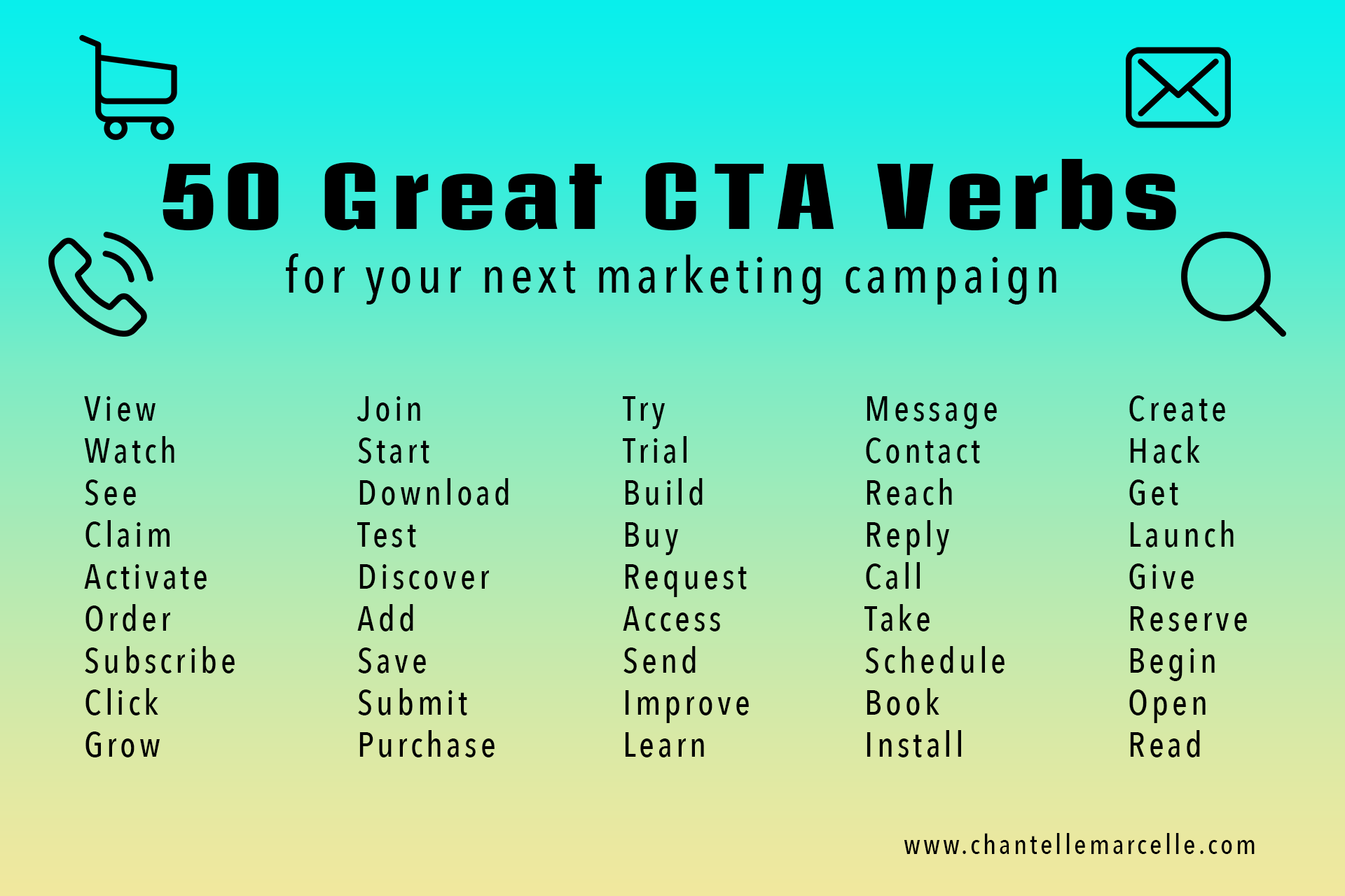
Scroll to the bottom to get some inspiration for your marketing CTAs!

The call-to-action.
It’s meant to be the focal point of the entire marketing campaign and each asset, whether that’s an email, social media post, blog post, landing page, or other.
I don’t know about you, but lately the CTA has really felt stale.
It feels like they’re all the same.
A standard button. Standard copy. Nothing really special or innovative, just your run-of-the-mill “Learn More” or “Contact Us” set up.
Sure, you don’t want the CTA to be overly complicated.
At the end of the day, you want it to be really straightforward so the user knows exactly what you want them to do and how to do it. CLICK HERE, and let’s get this show on the road!
But it serves no purpose to let such a vital component of a marketing campaign go to waste, just a plug-and-play element that provides no feeling of inspiration for either you or your user.
What if I told you the marketing call-to-action could be more than that?
Over the next few weeks (or months), I’m going to be conducting a variety of experiments with CTAs to see what impact can be had. I’d like to go beyond just simple experiments with color or button shape.
The copy is a huge one.
I believe that strong, powerful wording will have the most effect of all.
Hoping to report back soon with the initial results!
In the meantime, here’s a graphic I created to challenge both you and myself to be more creative when it comes to selecting verbs for marketing calls-to-action.
Until next time!


